
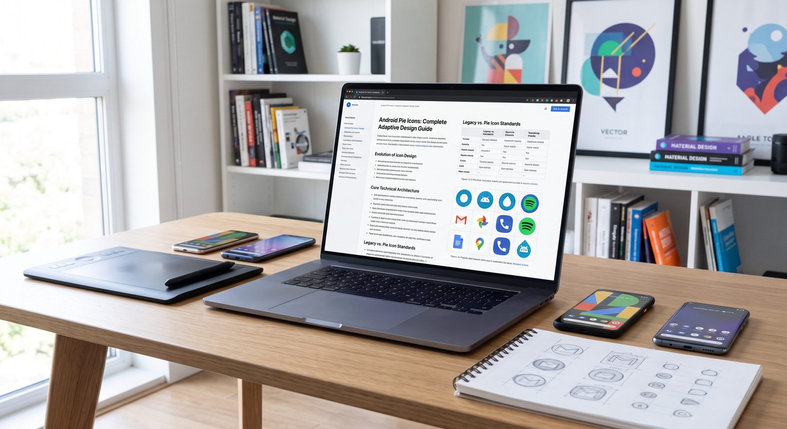
The digital mobile landscape evolves quickly, and user interface elements often mark major turning points in how we interact with technology. When Android 9.0 Pie debuted, it was not merely a routine software patch. It represented a fundamental transformation in user experience (UX) and visual aesthetics. Central to this evolution were android pie icons, a design paradigm that merged fluid adaptiveness, vibrant vector graphics, and clean material principles.
In today’s tech-driven world, app icons are no longer static images; they are dynamic, interactive gateways to digital experiences. Users demand consistency, speed, and visual harmony across diverse device screens. Understanding the design framework behind Android Pie icons offers incredible value for software developers, UI/UX designers, and tech enthusiasts alike.
This comprehensive guide breaks down the core architecture, layering systems, vector mechanics, and modern theme integrations of Android Pie icons. By learning how these iconography rules operate, you can optimize an app’s visual presence, improve user engagement, and align with modern Material Design guidelines.
Evolution of Android Icon Design
Android icon design has undergone a radical transformation over the past decade. Early versions of the operating system relied on free-form raster graphics, leading to mismatched home screens and visual clutter across different device manufacturers.
- Early Android Era: Unrestricted icon bounds caused inconsistent sizes and harsh visual contrasts.
- Material Design Debut: Introduced flat layers, subtle shadows, and uniform keyline shapes.
- Android Pie Refinement: Perfected adaptive iconography, ensuring system-wide visual unity regardless of OEM skinning.
- Modern Integration: Laid the structural groundwork for dynamic color theming and dark mode compatibility.
Core Technical Architecture of Android Pie Icons
The core feature of Android Pie icons is their adaptive layer architecture. Instead of exporting a single flat PNG, designers create dual-layer vector assets that the system crops and renders dynamically.
- Foreground Layer: Holds the central logo or primary motif with transparent surroundings.
- Background Layer: Provides a solid color, pattern, or full-bleed graphic beneath the foreground.
- System Masking: Devices apply hardware-level masks (circles, squircles, teardrops) without cutting into primary assets.
- Interactive Motion: Multi-layer construction enables parallax scrolling, tilt feedback, and touch physics.
Canvas Dimensions and Safe Zones
To keep android pie icons crisp and centered across all screen resolutions, precise canvas metrics and safety boundaries were established.
+------------------------------------+
|          108 x 108 dp Canvas       |
|                                    |
|       +--------------------+       |
|       |   66 x 66 dp       |       |
|       |   Safe Zone        |       |
|       |   (Inner Core)     |       |
|       +--------------------+       |
|                                    |
+------------------------------------+
- Full Canvas Size: Set strictly at 108 x 108 density-independent pixels (dp).
- Visible Viewport: The central 72 x 72 dp area visible after applying standard masks.
- Safe Zone Bounds: Critical visual elements must reside within a 66 x 66 dp inner circle to prevent cropping.
- Outer Padding: The remaining space allows for elastic motion and parallax shifting during screen navigation.
OEM Masking and Hardware Adaptability
One major challenge on Android is hardware fragmentation. Original Equipment Manufacturers (OEMs) use custom launcher shapes across various hardware builds. Android Pie icons solved this with unified OEM masking.
| OEM Launcher Variant | Standard Mask Geometry | Visual Result |
| Standard Pixel Interface | Circular Mask | Clean, rounded aesthetic across all app drawers. |
| Custom Manufacturer Interface | Squircle (Square-Circle) | Continuous soft edges matching rounded hardware corners. |
| Third-Party Launchers | Teardrop / Rounded Square | Custom user-selected shapes without icon distortion. |
Vector Drawables vs Raster Assets
Android Pie strongly prioritized vector-based XML graphics over traditional raster images (PNG, JPEG) for system launcher icons.
- Resolution Independence: Vectors scale seamlessly from low-density screens to high-end mobile displays.
- Reduced APK Footprint: Eliminates the need to pack redundant PNG folders across different density tiers.
- Smooth Rendering: Sharp vector paths prevent blurry edges and pixelation on high-DPI screens.
- Dynamic Styling: Allows programmatic color overrides and smooth state transitions during system theme changes.
Material Palette and Color Theory
Color selection in Android Pie icons follows strict Material Design palette principles to maintain legibility and visual hierarchy.
- Primary Contrast: High contrast between foreground artwork and background fill ensures immediate readability.
- Tonal Depth: Subtle gradient shifts replicate physical lighting without adding heavy legacy drop shadows.
- Vibrant Accent Tones: Bold colors help user eyes scan and locate target apps instantly.
- Dark Mode Foundation: Balanced color values prevent harsh contrast glare when switching to system dark themes.
Depth, Lighting, and Shadow Techniques
Unlike flat retro design systems, android pie icons utilize light sources to simulate subtle real-world physics and tangible layers.
- Top-Down Virtual Light Source: Light originates from 45 degrees above the icon canvas.
- Contact Shadows: Soft ambient shadows sit tightly around raised foreground layers.
- Edge Highlights: Tinted top edges simulate light reflection on physical materials.
- No Hard Borders: Avoids artificial outer stroke borders, relying instead on elevation gradients.
Dynamic Visual Effects and Parallax Engine
Separating background and foreground layers unlocked hardware-accelerated animations on the home screen.
- Parallax Dragging: Moving an icon causes the foreground and background to shift at different speeds.
- Elastic Bounce: Dragging apps triggers subtle spring physics between graphic layers.
- Touch Feedback Pressing: Tapping icons compresses the foreground slightly to confirm user input.
- Shortcut Transitioning: Smoothly transforms launcher icons into context-aware quick action popups.
Technical Comparison: Legacy vs. Pie Icon Standards
Understanding how Android Pie advanced past older operating systems clarifies why these standards remain foundational today.
| Feature Category | Legacy Android Icons (Pre-8.0) | Android Pie Icons (9.0+) |
| Layer Structure | Flat single-layer PNG files | Dual-layer Vector assets (Foreground + Background) |
| Shape Consistency | Fragmented, arbitrary outer boundaries | Standardized system-enforced masking shapes |
| Motion Physics | Static image assets | Dynamic parallax, tilt, and spring animations |
| File Format | Raster bitmap clusters (PNG) | Scalable XML Vector assets |
| Safe Boundary | Manual margins per OEM | Strict 66×66 dp inner safe area |
Implementing XML Configurations for Adaptive Icons
Building an android pie icon requires defining an adaptive XML resource that pairs foreground and background layers.
- File Location: Save resource files inside the native
res/mipmap-anydpi-v26/ic_launcher.xmldirectory. - Layer XML Structure: Declare
<adaptive-icon>wrapper elements enclosing foreground and background assets. - Vector Path Linking: Reference XML drawables for precise, resolution-independent rendering.
- Backward Compatibility: Provide fallback PNG assets in density buckets for older Android OS versions.
Keyline Grids and Geometric Alignment
Keyline grids give designers structural templates for building balanced icon shapes within the 108×108 dp canvas.
- Circular Keyline: 52 dp diameter for symmetrical central symbols.
- Square Keyline: 44 x 44 dp for square-bound branding elements.
- Vertical Rectangle: 52 x 36 dp for tall, narrow focal points.
- Horizontal Rectangle: 36 x 52 dp for wide horizontal branding structures.
Monochromatic Layering and Themed Icons Evolution
Android Pie’s layer separation laid the groundwork for future system features, such as system-wide wallpaper-matched color tinting.
- Monochrome Asset Layer: A single-color vector cutout used for dynamic system tinting.
- System Engine Integration: Tints app icons to match active wallpaper palettes automatically.
- Visual Minimalism: Eliminates bright brand colors when users activate unified dark or minimalist system themes.
- Accessibility Contrast: Automatically adjusts foreground-to-background contrast ratios for high visibility.
Common Design Mistakes and How to Avoid Them
Creating professional android pie icons requires avoiding a few frequent technical traps.
- Ignoring Safe Zones: Placing crucial logos outside the central 66 dp area, resulting in clipped graphics.
- Baking Shadows into Layers: Adding pre-rendered shadows, which break dynamic platform lighting.
- Over-Complex Foreground Vectors: Using excessive path points that slow home screen render performance.
- Transparent Background Layers: Leaving the background layer clear, which exposes black void boxes beneath the mask.
Tools for Creating Professional Adaptive Icons
Designers use modern tools to build and test adaptive Android icon sets efficiently.
- Native IDE Asset Tools: Built-in previewers for checking vector layers against OEM masks.
- Vector Design Software: Standardized artboards using keyline overlay guides to craft precise XML paths.
- Exporting Tools: Reliable plugins for converting high-resolution SVGs directly into project vector assets.
- Testing Workflows: Fast local tools for converting artwork into complete project folder structures.
Testing Icons Across Multiple Screen Densities
Thorough QA testing ensures your android pie icons render crisply across hardware environments.
- Density Bucket Validation: Test rendering across
mdpi,hdpi,xhdpi,xxhdpi, andxxxhdpidisplays. - OEM Mask Inspection: Verify alignment across circle, squircle, and rounded square mask masks.
- Launcher Interaction Testing: Confirm smooth motion physics during scrolling and app switching.
- System Mode Checks: Verify asset legibility under both Light and Dark system settings.
Frequently Asked Questions
What are android pie icons?
Android pie icons are adaptive launcher icons designed around dual-layer vector architecture (108×108 dp). They automatically adjust their outer shape to fit various OEM device themes while supporting motion effects like parallax scrolling.
How do adaptive icons differ from legacy Android app icons?
Legacy icons used single-layer static PNG images with fixed borders. Adaptive icons use separate foreground and background layers that system launchers mask dynamically into circles, squircles, or rounded squares.
What is the ideal canvas size for an adaptive icon?
The standard canvas size is 108 x 108 dp. However, critical visual elements must fit inside the central 66 x 66 dp safe zone to prevent clipping across different OEM shapes.
Why is my icon clipped or cropped on some devices?
Icon clipping occurs when artwork extends beyond the 66 x 66 dp inner safe area. When OEM launchers apply custom masks (like circles or squircles), anything outside this safe zone gets trimmed away.
Can I use raster PNG files for adaptive icons?
While vector XML files are strongly recommended for clean scaling, you can use transparent PNG images for the foreground and background layers as long as they meet the 108×108 dp dimension standard.
How do android pie icons support dark mode and system themes?
Layered icon structures allow modern Android versions to replace or tint the background and foreground assets with a single monochrome layer, creating themed icons that match system wallpapers automatically.
Do adaptive icons affect app performance or file size?
When authored using vector XML assets, adaptive icons actually reduce application bundle sizes compared to bundling dozens of legacy PNG raster variants across multiple density folders.
Conclusion
The shift toward android pie icons marked a major step forward for mobile design systems. By introducing two-layer adaptive architectures, precise keyline grids, and flexible vector assets, interface fragmentation was resolved across mobile devices.
Mastering these design techniques ensures applications maintain crisp visual consistency, render cleanly across all screen densities, and leverage modern system capabilities. Whether updating an existing app or designing a brand-new interface, applying these adaptive guidelines keeps digital products looking polished, modern, and engaging.